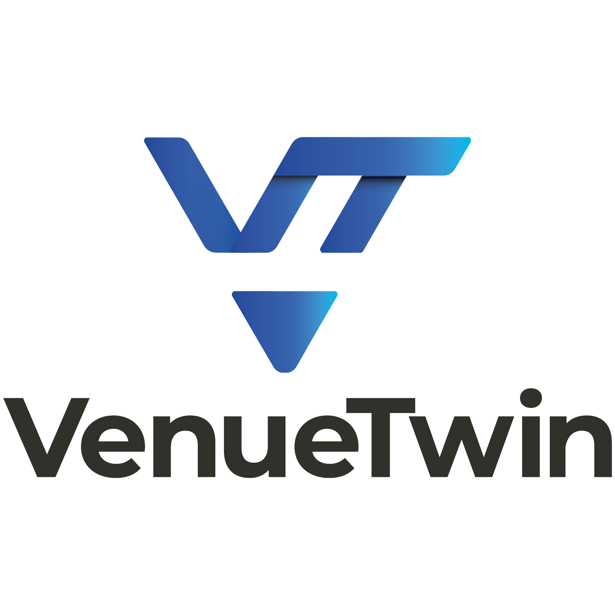
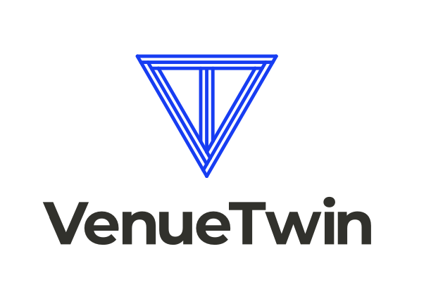
We’re so excited to share the new identity for VenueTwin, our award-winning digital twin platform for major venues. This project was not just about refreshing a logo but encapsulating VenueTwin’s evolution and its expanding horizons beyond stadiums to encompass any type of venue.
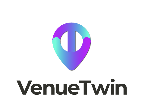
The outcome is a new identity based on the principles of our VenueTwin product. The logo incorporates a pinpoint geographical accuracy with a 3D quality from how its negative space shadows the logo’s positive space – a nod to how a digital twin reflects the real world. Importantly, it better complements our OnePlan logo to sit as a stronger suite of brand assets.
Here’s the design process we’ve been through to create a logo for the world’s leading digital twin platform for venues.
The brief to create a digital twin logo
The brand refresh was developed by our in-house team at OnePlan. Led by our Creative Lead, Elise Davies, the team’s key challenge was to update a logo to better reflect the ever-evolving qualities of our digital twin solution, and form a stronger connection to our main brand.
The rebranding challenge was multifaceted – to design a logo that:
- encapsulates simplicity, memorability, and timelessness
- implies a venue that is digitally twinned, by utilizing negative space
- aligns with the essence of our core OnePlan brand whilst still having its own distinctive visual identity
- has the adaptability to evolve for our additional products such as VenueTwin Viewer
Drawing inspiration from technology, venue and sports brands, Elise explored various design philosophies, emphasizing the importance of a distinctive yet cohesive brand identity within the OnePlan family.
Initial concepts that we explored
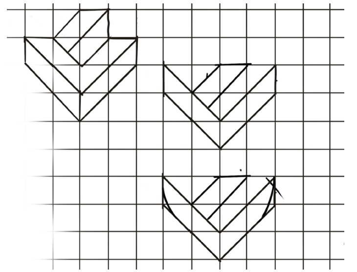
The creative process led to the exploration of several initial concepts, each with its unique story and design rationale.
Kinetic designs were explored to capture the dynamic nature of VenueTwin’s technology, drawing inspiration from the hyperjump feature inside Venue Twin.
Additionally, reflective, mirror-like motifs were considered to echo the ‘twin’ concept in VenueTwin.
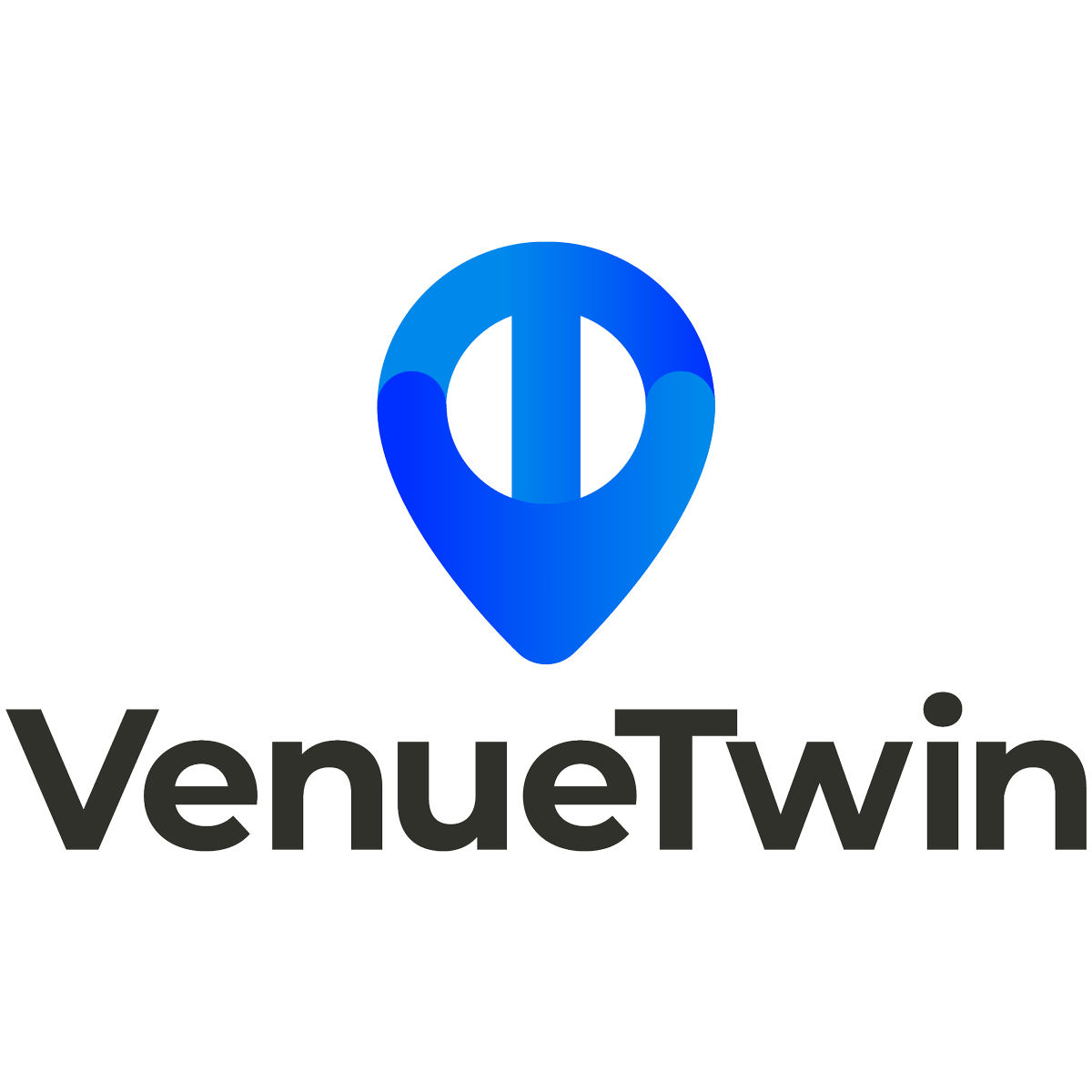
Combinations of letters and location points, reminiscent of the OnePlan logo, were also explored. The brand journey navigated many creative routes
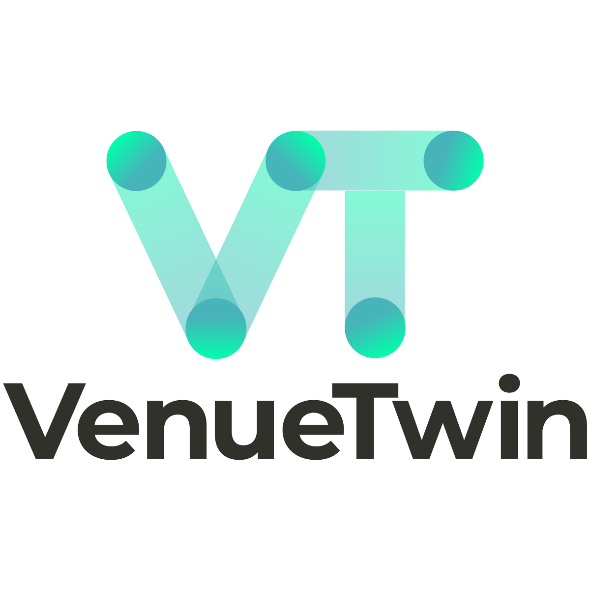
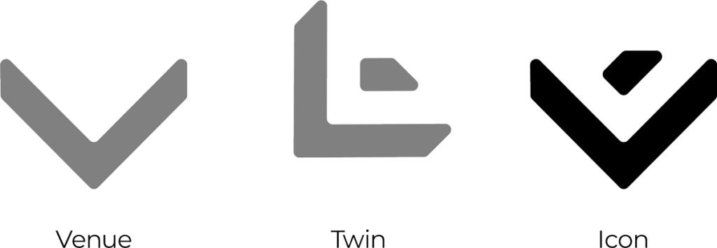
After exploring various ideas, a consistent theme emerged: incorporating the letters ‘V’ and ‘T’ into a design that’s simple yet impactful. This design resembles an arrow or a building corner, symbolizing movement and precision while hinting at Venue Twin’s 3D features. By rotating the icon, it cleverly forms the ‘V’ and ‘T’, adding another layer of depth to the design.
Refining the chosen route
Having found a concept we collectively loved, we then dived into its creative precision – something very true to the core of OnePlan. We delved into the details of the iconography and color palette to give it to vibrant, modern look. The logo’s negative space symbolizes routes in 3D-rendered spaces, while also constructing what looks like the corner of a cube, or building. The two sides of the ‘V’ come together to create a location point – a fundamental element of what our product offers for accurate GIS mapping.
The introduction of a vibrant new blue hue, alongside our signature orange, marked a bold evolution in VenueTwin’s visual identity. This strategic color choice was designed to establish a clear visual hierarchy and strengthen brand recognition. This choice was backed by a thoughtful analysis of color theory and complementarity – blue being the right complement of orange in color harmony rules – ensuring that the new palette would resonate with our audience and stand out in the digital realm.
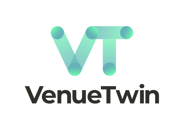
A new visual identity
The final logo is more than just a symbol; it’s a testament to OnePlan’s commitment to innovation, clarity, and functionality for our customers’ benefit. It embodies VenueTwin’s ability to provide unparalleled visualization of spaces, while also offering the flexibility to evolve with the product’s future enhancements.
The rebranding of VenueTwin is not just a change of visual identity but a reaffirmation of our commitment to delivering cutting-edge, innovative solutions that empower venue management and planning. VenueTwin is trusted by many of the world’s leading venues including Crypto.com Arena, the LA Clippers’ Intuit Dome, ExCeL London, the Paris 2024 Olympic and Paralympic Games and more. Its new identity is a creative expression of the innovative qualities and results it delivers.
We’re proud to launch this new look for VenueTwin and hope it inspires you to ever greater achievements when planning your venue.
Learn more about VenueTwin and how it can benefit your organization at the VenueTwin website, and book a demo to chat with one of our sales team.